1. Introduction
The platform provides a series of options to help perform analysis on the information produced by the users.
After defining the data structure using Queries, we should use these tools allow for modelers to determine how users are going to be able to see and interact with their data.
There are two different modelable entities that will be used for this purpose: Lists and Dashboards.
2. Lists
User Interface / Lists
In order to use the queries, we will need a place to show them. Lists are one of those places.
A list is little more than a way to see a query displayed in the web app: you select a query, (part or all of) its columns, and how to display those columns.
A list is automatically generated when a new entity is created. It is based on the automatically generated query.
How to create a list?
A list can be created automatically, based on a query, or manually.
To automatically create a new list based on a query, you must edit the query, and on top right More Options button, click on Generate List. A list will be automatically generated and can be edited later.
To create a list manually, select the option Add new when in the list of Lists, and fill in the following information:
- Name: the name of the list (needs to be unique);
- Description: the textual explanation of the list’s purpose (can be used as development documentation);
- Query: select a previously created query to use;
- Label: what label should be displayed for the list;
- Help Text: Auxiliary texts that explain the list’s purpose to the users.
When editing a list, it is also possible to change the Edit Action, to configure the action to be taken when editing an entity from a list. Possible values:
List Actions
| Action | Description | Additional Parameters |
|---|---|---|
| Navigate | Navigate to a entity. Default value | Definition and origin of the dataSource. |
| Open as Modal | Open an entity on a modal | Definition, origin of the dataSource and modal configuration |
| Raise onCellClick Event | Execute a code expression | Raise a cell click event, to be handled by a Dashboard code expression |
| No Action | List does not have link to navigate |
How to set the columns of a list?
When the list is created manually, after its creation it will be empty, and you must select which columns from the query you want to show.
By editing a list in the menu, and selecting the option Add new, navigate to the Related Query Properties tab and you can add the columns exposed by the query its based on. This is valid for simple queries or advanced queries whose output structure was defined.
You can also add list columns manually, by dragging a new column and filling the following information:
- name: The property of the query this column will represent. In case of advanced queries you will define the column alias;
- label: What the label of the column will say;
- helpText: Auxiliary text that explains this column to users;
- formattingType: Which formatting strategy should this column have. Similar to spreadsheet applications, i.e. a result of “5” can be shown normally, or formatted as a decimal.
- action: The action to be executed when the column is clicked. Possible values:
Column Actions
| Action | Description | Additional Parameters |
|---|---|---|
| No Action | Default value | |
| Navigate | Navigate to a entity | Definition and origin of the dataSource. |
| Open as Modal | Open an entity on a modal | Definition, origin of the dataSource and modal configuration |
| Raise onCellClick Event | Execute a code expression | Raise a cell click event, to be handled by a Dashboard code expression |
3. Dashboards
User Interface / Dashboards
A dashboard is a collection of elements (mainly lists) organized in a particular order.
When a new entity is created, a dashboard is automatically generated. This dashboard is shown when user lists the entities and contains only one element, the automatically generated list.
How to create a dashboard?
Select the option Add new when in the list of Dashboards, and fill in the following information:
- Name: the name of the dashboard (needs to be unique);
- Description: the textual explanation of the dashboard’s purpose (can be used as development documentation);
- Label: what label should be displayed for the dashboard;
- Help Text: Auxiliary texts that explain the dashboard’s purpose to the users.
Special case: A dashboard named Home will be automatically displayed in the homepage of the application.
How to change the dashboard Refresh and Add New behaviour?
When editing a dashboard, the default Refresh and Add New options can be configured by setting the following attributes:
- Refresh Option: set if the Refresh button should be visible, hidden or disabled;
- Add New Option: set if the Add New button should be visible, hidden or disabled;
- Refresh Action: set the action to be taken when the Refresh button is clicked: refresh or no action;
- Create Action: set the action to be taken when the Add New button is clicked: navigate, open as modal or no action;
When Refresh or Create actions are set to “No Action”, a UI Behaviour can be set to respond to the button click.
What elements can be added to dashboards?
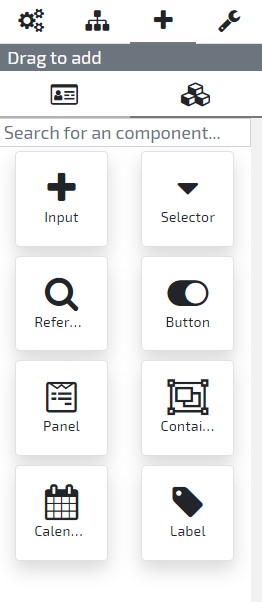
Dashboards can have the following elements:
- List: a list previously modeled;
- Calendar: a calendar view of the records. Calendars can be mapped to a list or its data can be obtained through behaviours (see here);
- WebComponent: a webcomponent previously modeled;
- Container: used for organization of other dashboard elements;
- Input: an input of any of the supported types (e.g.: text, date, reference to an entity, …);
- Button: a button that triggers its OnClick behaviour after a user clicks it;
- Panel: used for organization of other dashboard elements without adding any extra overhead.
- TabControl: used for organization of dashboard elements into tabs.
How to add elements to a dashboard?
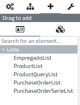
To add a new element check the right sidebar in the User Interface, where you’ll find the “Drag to add” section with two options:
Lists - Available lists in current model
Add new Element - Elements available to add to the current entity
Simply select the opinion you desire, and drag and drop the attribute or element type in the entities User Interface Dashboard.
When adding a new element to the layout, you also may fill the following information:
- name: the name of the element (needs to be unique);
- label: what label should be displayed for the element;
- helpText: Auxiliary texts that explain the element’s purpose to the users.
- description: the textual explanation of the element’s purpose (can be used as development documentation);
- listCode: which list should be displayed in this dashboard element;
- row: the layout row in which the element will be placed;
- column: the layout column in which the element will be placed;
- size: the element size on a scale of 1 (the smaller size) to 12 (the bigger size). Click here, to know more about elements size and columns;
Other information might be necessary when adding inputs:
- type: when input represents an Enumeration or Reference, indicate its base type;
- min/max: indicate the minimum and maximum number of records allowed;
- list: (on Reference inputs) Indicate the list to open when searching for a record;
-
dependsOnAttribute: (on Reference inputs of external data source entities) Indicate another dashboard input where the datasource data is set;
Note: Data source data can also be set on UI behaviours. Example:
this._metadata.elements.myInput.attributes.dataSource = "YourDataSource";
When adding a button, the following information can be specified:
- text: The button text.
- icon: Optionally it is possible to add an icon to the button (according to Font Awesome 4.7);
- color: The button color according to the theme (e.g.: Primary, Danger, etc.);
- outline: If the button only has a border instead of a background-color;
How to programmatically configure a list inside a dashboard?
The Lists contained within a Dashboard can be programmatically modified in run-time with the use of UI Behaviours.
- The disableLoad attribute can be used to prevent the list from automatically load after the dashboard initialization.
    // Inside dashboard onInitialize method
    this._metadata.elements.yourList.attributes.disableLoad = true;
- The queryParameters attribute allows you to set parameters of the Query that is executed by the List:
    this._metadata.elements.yourList.attributes.queryParameters = {
        ageLeftBoundary: 21,
        ageRightBoundary: 39
    };
- The filters attribute lets you set the List filters (i.e., those that are applied to the data the query returns. This filters are normally set by users on list headers):
    this._metadata.elements.yourList.attributes.filters = {
        _code: {
            operator: "EqualTo",
            value: "EMP0125"
        },
        _inactive: {
            operator: "NotEqualTo",
            value: true
        }
    };
- The sorting attribute enables the definition of the column sorting order:
    this._metadata.elements.yourList.attributes.sorting = [
        {
            column: "_code",
            direction: "Ascend"
        },
        {
            column: "_description",
            direction: "Descend"
        }
    ];
- The dataSource attribute allows you to force a Data Source on a List:
this._metadata.elements.yourList.attributes.dataSource = "YourDataSource";
- The disableFilters attribute can be used to prevent the user from overriding the List Filters:
this._metadata.elements.yourList.attributes.disableFilters = true;
- The disableSorting attribute can be used to prevent the user from overriding the List Sorting.
this._metadata.elements.yourList.attributes.disableSorting = true;
- The disableDataSourceSelection attribute can be used to prevent the user from changing the List Data Source when multiple Data Sources are in use.
this._metadata.elements.yourList.attributes.disableDataSourceSelection = true;
- The disableRefreshButton attribute can be used to hide the refresh button located on the list footer.
this._metadata.elements.yourList.attributes.disableRefreshButton = true;
- The disablePaginationButtons attribute can be used to hide the pagination info and navigation buttons (i.e., first, previous next and last page) located on the list footer.
this._metadata.elements.yourList.attributes.disablePaginationButtons = true;
- The disableOptionMenu attribute can be used to hide the options menu (e.g. export as csv) button located on the list footer.
this._metadata.elements.yourList.attributes.disableOptionMenu = true;
- The disableExportAutoDismiss attribute can be used to disable the toast notification auto dismiss on Export to CSV.
this._metadata.elements.yourList.attributes.disableExportAutoDismiss = true;
- The exportTimeToDismiss attribute can be used to change the default toast dismiss time (5000ms).The unit is milliseconds
this._metadata.elements.yourList.attributes.exportTimeToDismiss = 10000;
- The exportFileName attribute can be used to change the name of the exported CSV file.
this._metadata.elements.yourList.attributes.exportFileName = 'myNewFile.csv';
- The load() method forces the List to obtain and present the data:
this._metadata.elements.yourList.load();
How can I change the list export configuration on execution time?
To set the list export configuration when the user clicks the Export to CSV option, the following code can be added to the onCsvExport event:
    parameters.autoDismiss = false; //if set to true, the toast will only be dismissed by user action. If set, timeToDismiss parameter will be ignored
    parameters.timeToDismiss = 1000; //time to dismiss the toast set to 10000ms
    parameters.fileName = 'myExportedList.csv'; //the name of the exported file
4. User Interface Behaviours
User Interface / Dashboard / User Interface Behaviours
In order to extend your application user interface you can add new behaviours to your dashboard user interface.
Click here, to know more about user interface behaviours.
How to refresh the entire dashboard?
THe dashboard can be refreshed by calling its metadata refresh function:
this._metadata.refresh();
How to define the auto refresh interval of the dashboard?
In this sample, the auto refresh interval is set to 30 seconds:
this._metadata.attributes.autoRefreshInterval = 30;
Note: The unit of measure of autoRefreshInterval property’s value is the second.
How to hide the dashboard “refresh” button?
The refreshOption dashboard attribute is used to set the visibility of the dashboard’s predefined “refresh” button:
this._metadata.attributes.refreshOption = "hidden";
In order to set the button to visible:
this._metadata.attributes.refreshOption = "visible";
How to hide the dashboard “Create New” button?
The addNewOption dashboard attribute is used to set the visibility of the dashboard’s predefined “Create new” button:
this._metadata.attributes.addNewOption = "hidden";
In order to set the button to visible:
this._metadata.attributes.addNewOption = "visible";