1. User Interface
User Interface / Forms
In OMNIA Platform you can customize how the fields are shown in the form generated to create or edit your entity.
Automatically, the platform adds and removes user interface elements when a new attribute is added or an existing one is deleted from an entity.
The form layout is organized with Rows and Columns. Each row is divided horizontally in 12 columns.
How to add a new element?
To add a new UI element open the form by accessing the menu option User Interface / Forms and selecting the form in the list. Once the form is opened you’ll find the “Drag to add” section with two options:
Related Entity Attributes - Attributes of the current entity
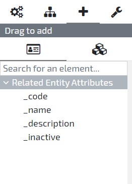
Add new Element - Elements types available to add to the current entity
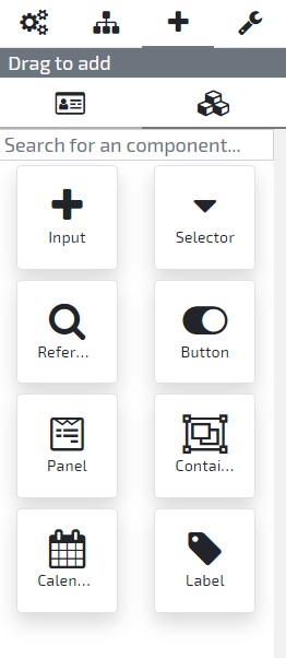
Simply select the option you desire and drag and drop the attribute or element type in the entity’s Form previewer.
When adding a new element to the layout, you also may fill the following information:
- name: the entity attribute this element will represent in the layout (will allow you to read and write in this attribute);
- label: the element caption;
- helpText: the detailed description of the element;
- row: the layout row in which the element will be placed;
- column: the layout column in which the element will be placed;
- size: the element size on a scale of 1 (the smaller size) to 12 (the bigger size). Click here, to know more about elements size and columns;
- isHidden: the visibility of the element (hidden or visible);
- visibleFrom: the visibility of the element, related to the user’s device screen size (at sizes smaller than the one selected, the element will be hidden);
After the element configuration, it’s important to save your changes to persist it.
How to add a new container element?
To add a new container check the right sidebar in the Form, where you’ll find the “Drag to add” section. Select the Add new Element option.
Now select and hold the Container option, drag and drop it in the entity’s User Interface previewer. You may also fill the following information:
- name: the element’s unique identifier attribute;
- label: the element caption;
- helpText: the detailed description of the element;
- row: the layout row in which the element will be placed;
- column: the layout column in which the element will be placed;
- size: the element size on a scale of 1 (the smaller size) to 12 (the bigger size). Click here, to know more about elements size and columns;
- isHidden: the visibility of the element (hidden or visible);
- visibleFrom: the visibility of the element, related to the user’s device screen size (at sizes smaller than the one selected, the element will be hidden);
How to add a new panel element?
In the Form page, select the Drag to add / Add new Element section, click on the panel element to drag it to your layout. Then, fill the following information:
- name: the element’s unique identifier attribute;
- label: the element caption;
- helpText: the detailed description of the element;
- row: the layout row in which the element will be placed;
- column: the layout column in which the element will be placed;
- size: the element size on a scale of 1 (the smaller size) to 12 (the bigger size). Click here, to know more about elements size and columns;
- isHidden: the visibility of the element (hidden or visible);
- visibleFrom: the visibility of the element, related to the user’s device screen size (at sizes smaller than the one selected, the element will be hidden);
How to add a new tab control element?
In the Form page, select the Drag to add / Add new Element section, click on the Tab Control element to drag it to your layout. Then, fill the following information:
- name: the element’s unique identifier attribute;
- label: the element caption;
- helpText: the detailed description of the element;
- row: the layout row in which the element will be placed;
- column: the layout column in which the element will be placed;
- size: the element size on a scale of 1 (the smaller size) to 12 (the bigger size). Click here, to know more about elements size and columns;
- isHidden: the visibility of the element (hidden or visible);
- visibleFrom: the visibility of the element, related to the user’s device screen size (at sizes smaller than the one selected, the element will be hidden);
- activeTab: the Tab Page that should be visible when the tab control is rendered. In order to set the active tab, it is required to drag and drop Tab Pages into the Tab Control;
How to add a new calendar element?
To add a new calendar check the right sidebar in the Form user interface, where you’ll find the Drag to add / Add new Element section.
Now select and hold the Calendar option, drag and drop it in the entity’s User Interface preview. You also need to fill the following information:
- name: the element’s unique identifier attribute;
- mapping: the element, of type collection, that will be used as a data source; (In case of a single date event, use the Date Mapping option, if you require a date interval, use Start and Finish Date Mapping instead)
- dateMapping: the collection element that will represent the calendar’s event date;
- startDateMapping: start date of the date mapping;
- endDateMapping: end date of the date mapping;
- titleMapping: the element that will be used to define the title property;
- categoryMapping: the element that will be used to define the category property;
- initialView: the calendar view that is shown by default (default value: month);
- modalSize: the size of the calendar modal (default value: medium);
- label: the element caption;
- helpText: the detailed description of the element;
- row: the layout row in which the element will be placed;
- column: the layout column in which the element will be placed;
- size: the element size on a scale of 1 (the smaller size) to 12 (the bigger size). Click here, to know more about elements size and columns;
- isHidden: the visibility of the element (hidden or visible);
- visibleFrom: the visibility of the element, related to the user’s device screen size (at sizes smaller than the one selected, the element will be hidden);
How to change the position of an element?
In the Form user interface, select the element you want to change and drag it to the new position. You can also adjust other elements position if necessary.
How to change the size of an element?
In the Form user interface, select the element you want to change and, in the Size field, select the new size. Click here, to know more about elements size and columns.
How to remove an element?
In the Form user interface, select the element you want to remove, click on the Delete button and confirm your option in the confirmation window.
How to change the Form redirect behaviour?
By default, when an operation is executed on a form (e.g. Save, Delete or a state machine decision), the user is redirected to the previous page.
This behaviour can be changed by setting the attribute Redirect Action. The following options are available:
- Back Navigation: returns to the previous page. Default behaviour;
- Back Entity Dashboard: redirects to the Entity Dashboard;
- No Action: no redirect occurs. When this option is selected, redirect logic must be implemented on Form After Save behaviour;
2. User Interface Behaviours
User Interface / Forms
In order to extend your application user interface you can add new behaviours to your entities’ Form.
Click here, to know more about user interface behaviours.
Accelerators
-
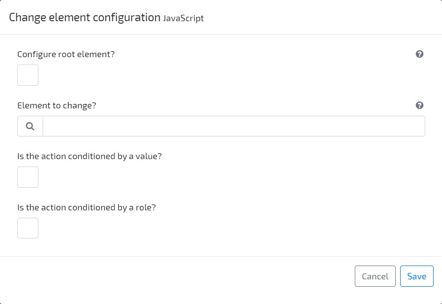
Change Element Configuration Change the configuration of the Form being edited or of any element located inside it. All the element attributes are available to be changed (e.g. isHidden, visibleFrom, label). Conditions may be applied (value or role).
Examples:
- Depending on the user role, allow your Supplier to edit the field “Unit Price”, while the customer only sees it as read only.
- A user selects his payment option and that action will hide the unnecessary elements.
-
Add Validation Message Quickly add validation messages to your interface elements, add the trigger conditions (value or role) and define the content of your message Example: If a user tries to add an invalid email on a field, an error message is returned indicating that.
-
Execute Application Behaviour Accelerator that generates code to make an HTTP request to the OMNIA API that calls a given Application Behaviour
-
Execute Query Accelerator that generates code to make an HTTP request to the OMNIA API that executes a query and returns the results.
Casing
Because OMNIA WebApp is following the JavaScript best practices, the elements’ names are in camelCase.
In the following sample, to access the value representing the attribute TotalAmount, is used the totalAmount property.
this.totalAmount
How to hide an element?
In this sample, base element _code is set as hidden:
this._metadata.elements._code.isHidden = true;
How make an element read-only?
In this sample, base element _code is set as read only:
this._metadata.elements._code.attributes.isReadOnly = true;
How make an element required in the UI?
In this sample, element email is set as required:
this._metadata.elements.email.attributes.min = "1";
How to change the size of an element?
In this sample, custom element supplier size is changed:
this._metadata.elements.supplier.size = 1;
Click here, to know more about elements size and columns.
How to set an element value?
In this sample, custom element supplier value is changed:
this.supplier = "S001";
How to add or remove a message?
In this sample a message is removed, and added, to the base element _code:
    this._metadata.elements._code.removeMessage('validation');
    if(this._code === '')
        this._metadata.elements._code.addMessage('My error message', 'error', 'validation');
    else
        this._metadata.elements._code.addMessage('My success message', 'success', 'validation');
Note: There are only two types of messages available, as shown in the previous sample: error and success.
How to manage the state of the entities default options?
In this sample, the default entity options Save, Show history, Delete record and Destroy sensitive data are set as hidden:
    // Hide History option
    this._metadata.attributes.showHistoryOption = "hidden";
    // or Disable History option
    this._metadata.attributes.showHistoryOption = "disabled";

    // Hide Delete option
    this._metadata.attributes.deleteOption = "hidden";
    // or Disable Delete option
    this._metadata.attributes.deleteOption = "disabled";

    // Hide Destroy option
    this._metadata.attributes.destroyOption = "hidden";
    // or Disable Destroy option
    this._metadata.attributes.destroyOption = "disabled";

    // Hide Save option
    this._metadata.attributes.saveOption = "hidden";
    // or Disable Save option
    this._metadata.attributes.saveOption = "disabled";
How to redirect to another application page?
In this sample, the user will be redirected to another page of the application, using an existing function of the Form/Dashboard context:
    // The application will be redirected to the dashboard of the entity Employee
    this._context.redirectToApplicationAddress('Employee');
How to have asynchronous behaviours?
In this sample, the behaviour returns a Promise, that will allow the behaviour to execute asynchronously:
    return new Promise(
        (resolve) => {
            // your code here
            resolve();
        }
    );
How to open or close a container?
In this sample, the container myContainer is set as opened:
    //set isOpen as 'true' to open and as 'false' to close the container
    this._metadata.elements.myContainer.attributes.isOpen = 'true';
How to inform the user that an element is loading data?
Inputs give you an attribute to control an internal loader. This is particularly useful when a triggered C# behaviour will change the value of other elements and we want to inform the user that something is happening relative to that element. You will be responsible to enable and disable the loader. Example: enable, or disable, it when a given element changes its value in the UI After Change behaviour.
this._metadata.elements._description.attributes.isLoading = true;
How to block the whole form while loading data?
As a part of the Form metadata, you have an attribute to control an internal loader, and show a context message. This is particularly useful in scenarios where data is being loaded to the UI, and we want to ensure that the user cannot interact with the attributes. You will be responsible to enable and disable the loader.
Example: enable it when a given element changes its value and a HTTP request is made to retrieve additional data. Disable it when the HTTP request is processed and its data applied to the attributes
    //Enable loader
    this._metadata.attributes.isLoading = true;

    //Show context message with the loader
    this._metadata.attributes.loadingMessage = "Loading... Please wait";

    //Disable loader
    this._metadata.attributes.isLoading = false;
How to show a toast message?
A toast with the same look as the ones used by the platform can be launched with custom messages
Example on how to show a toast with a custom message
    /*Parameters:
        Style. Possible values: INFO, SUCCESS, WARNING, ERROR
        Title
        Message
        [Optional] Auto Dismiss. true by default
        [Optional] Time to dismiss (in ms)
        [Optional] Has action link. false by default
        [Optional] Link to show
        [Optional] Has file to be downloaded. false by default
        [Optional] Callback function to download the file
    */
    this._context.showToast(this._context.toastStyle.INFO, "Info Title", 'Info Message', true, 5000);
On a Page , the function must be called as the following example:
context.uiTools.showToast(context.uiTools.toastStyle.INFO, "Info Title", 'Info Message', true, 5000);
How to force a new page render?
applyUIChanges function can be used to force a new page render that will apply all pending changes to the UI.
This function is useful to render changes from the execution of a async behaviour.
    //add a full page loader
    this._metadata.attributes.isLoading = true;

    apiClient.doPost(`/api/v1/${this._context.tenant.code}/${this._context.tenant.environmentCode}/application/behaviours/Default/GetData`, {})
        .then(response => {
                //process response...

                //Remove loader
                this._metadata.attributes.isLoading = false;

                //applyUIChanges to remove loader
                this._context.applyUIChanges();
        });
On a Page , the function must be called as the following example:
context.uiTools.applyUIChanges();
How to know if the form is on create or edit mode?
The following expression returns the view mode value (create or edit):
this._context.operation.viewModel
Decimal Attributes
How to change the number of decimal places of the element?
In this sample, the number of decimal places of the element decimalField is set to a custom value (3).
this._metadata.elements.decimalField.attributes.precision = 3;
Note 1: This is only possible in elements that represent decimal attributes. In the other data types, even this attribute is set, the value will be ignored.
Note 2: This only changes the number of decimal places in the interface. In order to apply decimal places to the server-side data, you need to develop that logic using C# behaviours.
Date Attributes
How to set an date element value?
In this sample, custom element createdDate value is changed:
this.createdDate = this._context.createMoment('2025-12-31');
Note: For other ways of setting a date, please check momentjs documentation
How to get a date on a specific format?
In this sample, the date value of the attribute dateField is retrieved on format YYYY-MM-DD.
const formattedDate = this.dateField.format("YYYY-MM-DD");
Note 1: This is only possible in elements that represent date attributes.
Note 2: This only retrieves the value on that format to be used on Javascript behaviours. It does not change the format of the date visible to the user
Shared Attributes
How to change the shared attribute’s lookup list?
In this sample, the lookup list of the attribute employee is changed to a custom list:
this._metadata.elements.employee.attributes.list = 'MyCustomEmployeeList';
How to filter a shared attribute’s lookup list?
In this sample, the lookup list of the attribute employee is filtered using the data (in the case, the value of company) of the current entity:
    this._metadata.elements.employee.attributes.listParameters = {
        company: this.company
    };
Title and Breadcrumb
How to set a page title?
The page title is shown on the top right side of a form or dashboard.
To set a page title add the following code:
this._context.setPageTitle('My page Title');
How to set a page breadcrumb?
The breadcrumb for a form or dashboard is automatically suggested, but it can be redefined.
Each part of a breadcrumb can link a different location, and optionally the go back configuration can also be defined.
To set a breadcrumb add the following code:
    //instantiate a translator. Required only if we want to translate the breadcrumb
    const translator = this._context.getLanguageTranslator();

    this._context.setBreadcrumbText([{
            text: translator.translateToApplication('${Texts.Homepage}'), //the translated text to show on the breadcrumb part.
            address: `/${this._context.tenant.code}/${this._context.tenant.environmentCode}` //the address to navigate
        },
        {
            text: "Dashboard",
            address: `/${this._context.tenant.code}/${this._context.tenant.environmentCode}/PurchaseOrder/Default`
        },
        {
            text: "View",
        },
    ]);
The code above sets a breadcrumb with three parts, where the first two have an address to redirect, and the last is static.
To set a breadcrumb that starts with an icon add the following code:
    this._context.setBreadcrumbText([{
            text: "Home",
            address: `/${this._context.tenant.code}/${this._context.tenant.environmentCode}`
        }
    ], {
        value: "home", //the icon code
        color: "Red" //the icon color
    });
To set a breadcrumb with a custom go back configuration add the following code:
    this._context.setBreadcrumbText([{
            text: "Home",
            address: `/${this._context.tenant.code}/${this._context.tenant.environmentCode}`
        }
    ], {
        value: "home",
        color: "Red"
    }, {
        isHidden: false, //set as true to hide the back button
        address: `/${this._context.tenant.code}/${this._context.tenant.environmentCode}/Dashboard/BackDashboard`, //the address to navigate
        tooltip: "Go back" //the button tooltip
    });
Calendar
How to set the entries of a calendar?
To each entry is necessary to define the date and the title. The category can also be defined, in order to group the entries.
In this sample, the entries of the element calendar are set:
    this._metadata.elements.calendar.attributes.entries = [
        { date: '2025-12-25', title: 'Christmas', category: 'Holidays' },
        { date: '2025-12-23', title: 'Vacations: Mary Smith', category: 'EmployeeVacations' }
    ]
How to set the categories of a calendar?
To each category is possible to define the name (used as the unique identifier), a title and a color. Is also possible to set the category as inactive by default.
In this sample, the categories of the element calendar are set:
    this._metadata.elements.calendar.attributes.categories = [
        { name: 'Category01', title: 'Le 1st category', color: '#d90dea', startAsInactive: true },
        { name: 'A', title: 'Le "A" category', color: '#259fb4', startAsInactive: false }
    ]
How to change the initial date of a calendar?
In this sample, the date where the calendar will be positioned when is initialized is set:
this._metadata.elements.calendar.attributes.initialDate = '2025-01-06';
How to change the initial view of a calendar?
In this sample, the view in which the calendar is initialized is set:
this._metadata.elements.calendar.attributes.initialView = 'year';
The following views are available:
| Value | Description |
|---|---|
| ‘week’ | One week view as calendar |
| ‘month’ | One month view as calendar |
| ‘year’ | One year view as calendar |
| ‘week_schedule’ | One week view as schedule |
| ‘month_schedule’ | One month view as schedule |
| ‘year_schedule’ | One year view as schedule |
How to set the calendar start and finish date?
In this sample, the start and finish date is set. Dates outside the range are blocked
    this._metadata.elements.calendar.attributes.startsAt = '2025-01-01';

    this._metadata.elements.calendar.attributes.finishesAt = '2025-12-31';
How to execute an action when the view is changed?
In this sample, a function is added to the calendar metadata, in order to be executed every time the calendar’s view is changed:
    this._metadata.elements.calendar.onDataRangeChange = (startDate, finishDate, view) => {
        // your code here
    }
Note: Starting on platform version 3.5.260, this function should be modeled as a Calendar On Date Range Change Behaviour. If the Behaviour is modeled and the function exists on a Javascript expression, the modeled Behaviour will not be executed.
How to execute an action when a category is toggled?
In this sample, a function is added to the calendar metadata, in order to be executed every time a category is activated or deactivated:
    this._metadata.elements.calendar.onCategoryToggle = (category, isActive) => {
        // your code here
    }
Note: Starting on platform version 3.5.260, this function should be modeled as a Calendar On Category Toggle Behaviour. If the Behaviour is modeled and the function exists on a Javascript expression, the modeled Behaviour will not be executed.
How to execute an action when the calendar modal form is opened?
In this sample, a function is added to the calendar metadata, in order to be executed every time a calendar event is clicked:
    this._metadata.elements.calendar.onFormOpen = (line) => {
        // your code here
    }
Note: This function is only available when the Calendar is mapped and located on a form. Starting on platform version 3.5.260, this function should be modeled as a Calendar On Form Open Behaviour. If the Behaviour is modeled and the function exists on a Javascript expression, the modeled Behaviour will not be executed.
How to execute an action when the calendar modal form is closed?
To execute an action when the form is closed, the On Form Close Behaviour should be implemented.
Note: This function is only available when the Calendar is mapped and located on a form.
How to execute an action when a calendar entry is clicked?
To execute an action when a calendar entry is clicked (e.g. redirect, open in a modal), the On Event Click Behaviour should be implemented.
Note: This function is only available when the Calendar is mapped and located on a dashboard.
How to customize ICS record when an event is exported?
By default, when exporting an event to an ICS record, the following attributes are present:
- SUMMARY: is set with the value of the data attribute configured in Title mapping
- DTSTART: is set with the value of the data attribute configured in Date mapping or Start Date mapping when Date mapping is not set
- DTEND: is set with the value of the data attribute configured in Date mapping or End Date mapping when Date mapping is not set
- CATEGORIES: is set with the value of the data attribute configured in Category mapping
- UID: is set with the generated UUID value;
- SEQUENCE: is set with the value 0;
- STATUS: is set with the value CONFIRMED;
- TRANSP: is set with the value TRANSPARENT;
The ICS record can be customized using the calendar’s event On Event Export. This event received the following parameters:
- dataEvent: the event data
- isMapped: flag to identify if the event source is from data mapping or the calendar attributes entries
- exportEvent: the export event to be changed
- exportType: the type of export event to be changed
In this sample DTSTART and DTEND are been customized to include time get from the text attributes start and end:
    if (!isMapped || !dataEvent.date) return;
    if(exportType === 'ics'){
        delete exportEvent["DTSTART;VALUE=DATE"];
        delete exportEvent["DTEND;VALUE=DATE"];

        const dtStart = dataEvent.date?.clone() ?? moment();
        const tStart = dataEvent?.start?.split(":") ?? [0, 0];
        dtStart.hour(tStart[0]);
        dtStart.minute(tStart[1]);
        exportEvent["DTSTART"] = `${dtStart.format('YYYYMMDDTHHmmss')}Z`;

        const dtEnd = dataEvent?.date?.clone() ?? moment();
        const tEnd = dataEvent?.end?.split(":") ?? [0, 0];
        dtEnd.hour(tEnd[0]);
        dtEnd.minute(tEnd[1]);
        exportEvent["DTEND"] = `${dtEnd.format('YYYYMMDDTHHmmss')}Z`;
    }
Web Components
The Web Component instance will be available to interact with in the JS object and is identified by the name of the element. Due to the array of supported browsers, the Javascript should be written in ES6 format.
How to set a value of a Web Component’s property?
In this sample, a custom property’s value of a Web Component is set:
this.myWebComponent.theProperty = "The new value";
How to call a function of a Web Component?
In this sample, a custom function of a Web Component is executed:
this.myWebComponent.theFunction(parameter1, parameterN);
Grids
How to add new lines to a collection?
In this sample, we’re adding a new line to the collection named myCollection and setting some data:
    this.addTo_myCollection(this._context.cloneObject(this._metadata.elements.myCollection), true).then((newRecord) => {
        newRecord._resource = "P001";
        newRecord._provider = "S001";
        newRecord._receiver = "C001";
        newRecord._quantity = 10;
    });
How to manage the state of the add and remove options in a grid?
In this sample, the options to remove or add records of custom element collection are changed based on a condition:
    // Disable options
    this._metadata.elements.collection.attributes.addEntry = "disabled";
    this._metadata.elements.collection.attributes.removeEntry = "disabled";

    // Hide options
    this._metadata.elements.collection.attributes.addEntry = "hidden";
    this._metadata.elements.collection.attributes.removeEntry = "hidden";

    // Enable and show options
    this._metadata.elements.collection.attributes.addEntry = "enabled";
    this._metadata.elements.collection.attributes.removeEntry = "enabled";
How to move an element to the details area of a grid?
This feature only applies to the inner elements of a collection element. In this sample, the element notes (which is an inner element of collection) is placed in the details area:
this._metadata.elements.collection.elements.notes.attributes.isDetails = true;
How to open or close a grid details area?
In this sample, the details area of the first line of the collection collection is set as opened:
    //set isDetailsOpen as 'true' to open and as 'false' to close the collection details area
    this.collection[0]._metadata.attributes.isDetailsOpen = 'true';
How to change a grid details area expansion behaviour?
The grid details area expansion can assume the following behaviours:
| Value | Description |
|---|---|
| ‘autoExpansion’ | Expand any line that is added or edited (default behaviour) |
| ‘noExpansion’ | Do not expand added or edited lines automatically |
| ‘expandCurrentLine’ | Expand the line being worked on, collapsing others |
In this sample, the details area is set to expand the line being worked on:
    //set detailsExpandability as 'expandCurrentLine'
    this._metadata.collection.attributes.detailsExpandability = 'expandCurrentLine';
How to enable multiple selection of references in a grid?
This feature only applies to grids that contain at least one inner element of type reference.
In this sample we’re enabling only one element named product (which is an inner reference element of collection) for multiple selection:
    this._metadata.elements.collection.attributes.multipleSelection = [
        { name: "product" }
    ];
To set more elements, simply add then to the multipleSelection list:
    this._metadata.elements.collection.attributes.multipleSelection = [
        { name: "product" },
        { name: "resource" },
        ...
    ];
In the sample below, the element product uses the custom Data Source externalDatabase:
    this._metadata.elements.collection.attributes.multipleSelection = [
        { name: "product", dataSource: this.externalDatabase },
        { name: "resource" },
        ...
    ];
When the Data Source is not static, meaning it can change depending in another element of the Form, instead of dataSource it should be identified using dataSourceAttribute.
In this sample the element database (which is not an inner element of collection, but another element of the Form) defines the Data Source of the product element:
    this._metadata.elements.collection.attributes.multipleSelection = [
        { name: "product", dataSourceAttribute: "database" },
        { name: "resource" },
        ...
    ];
Custom Modals
How to open an Entity on a Modal?
In order to open an already created entity in a modal you must add a new User Interface (UI) Behaviour to the entity you wish to open the modal from.
The following properties are available when declaring a new modal instance:
| Value | Type | Required | Description |
|---|---|---|---|
| ‘disableCloseButton’ | boolean | no | Be cautious when declaring this property because the modal might not close if you don’t add the necessary code for it (explained below). |
| ‘hideFooter’ | boolean | no | Be cautious when declaring this property because the modal will not have the default option to close. You should add the necessary code for closing it (explained below). |
| ‘hideHeader’ | boolean | no | Declare it if you intend to hide the title of the modal. |
| ‘id’ | string | no | The unique identifier necessary to close the modal. |
| ‘name’ | string | yes | The name of the entity to open inside the modal. |
| ‘onClose’ | function | no | A callback function the triggers after the modal is closed. It receives a result (string) value and an args (object). The default value of result is Close. |
| ‘parameters’ | object | no | Any other information you wish to save inside the modal to use later. |
| ‘formConfiguration’ | object | no | Optional configuration when opening a modal with a form. |
| ‘listConfiguration’ | object | no | Optional configuration when opening a modal with a list. |
| ‘confirmationConfiguration’ | object | no | Optional configuration when opening a confirmation modal. |
| ‘inputMessageConfiguration’ | object | no | Optional configuration when opening a modal to input a message. |
| ‘exportCSVConfiguration’ | object | no | Optional configuration when opening a modal to export a CSV. |
| ‘pageConfiguration’ | object | no | Optional configuration when opening a modal with a page. |
| ‘size’ | string | no | There are four possible sizes: small, medium, large and extra-large. The default value is extra-large. |
| ‘title’ | string | no | The text that appear in modal’s header. The default is the entities name. |
| ‘type’ | string | yes | Identify the type of the entity. The following types are available: Dashboard, Form, Page, List, Confirmation, InputMessage, ExportCSV. |
How to declare a modal:
    //Modal to open a dashboard
    const modal = {
        name: "TermsOfServiceDashboard",
        type: "Dashboard"
    }
    //Modal to open a form
    const modal = {
        name: "SupplierForm",
        type: "Form",
        //optional
        formConfiguration: {
            //Code of the entity to open. Use only when editing an existent entity.
            instanceCode: "S001",
            //DataSource of the entity being edited
            dataSource: "Default",
            //State of the button to close modal. Possible values: hidden or disabled. Default value is visible
            closeButton: "hidden"
        }
    }
    //Modal to open a list
    const modal = {
        name: "SuppliersByCountryList",
        type: "List",
        listConfiguration: {
            //The dataSource where the query will be executed. If not defined, "Default" is assumed as value.
            dataSource: "Default",
            //Query parameters. Optional
            parameters: {
                country: "Portugal"
            },
            //Filters to be applied. Optional
            filters: {
                _code: {
                    operator: "Like",
                    value: "ALCAD"
                },
                _inactive: {
                    operator: "NotEqualTo",
                    value: true
                }
            }
        }
    }
    //Modal to open a page
    const modal = {
        name: "SupplierPage",
        type: "Page",
        //optional
        pageConfiguration: {
            //Parameters to be sent on page url. Optional
            urlParameters: {
                code: "SOFRIO"
            }
        }
    }
    //Modal that requests a confirmation from the user
    const modal = {
        name: "DeleteConfirmationModal",
        type: "Confirmation",
        confirmationConfiguration: {
            //Message to be shown on modal. Optional
            message: "Are you sure you want to delete the current Entity?",
            //Type of confirmation button. Possible values: 'ok' or 'Delete'
            buttonType: 'delete'
        }
    }
    //Modal that allows the user to input a text
    const modal = {
        name: "CommentInputMessageModal",
        type: "InputMessage",
        inputMessageConfiguration: {
            //Message to be shown on modal as the input label. Optional
            label: "Decision Comment:",
            //Boolean to define if the text is required. Optional
            require: false,
            // The maximum length of the text input. Optional
            maximumLength: 256
        }
    }
    //Modal to export a query to CSV
    const modal = {
        name: "SuppliersByCountryExportModal",
        type: "ExportCSV",
        exportCSVConfiguration: {
            //The query whose data will be exported
            query: "SuppliersByCountryQuery",
            //The dataSource where the query will be executed. Optional, if not defined "Default" is assumed
            dataSource: "Default",
            //List of columns to be exported
            columns:[
                {
                    property: "_code",
                    label: "Code"
                },
                {
                    property: "_name",
                    label: "Name"
                }
            ],
            //Query sorting by column. Optional
            sorting: [
                {
                    property: "_code",
                    direction: "Ascend"
                }
            ],
            //Query parameters. Optional
            parameters: {
                country: "Portugal"
            },
            //Filters to be applied. Optional
            filters: {
                _code: {
                    operator: "Like",
                    value: "ALCAD"
                },
                _inactive: {
                    operator: "NotEqualTo",
                    value: true
                }
            }
        }
    }
To open the modal on a Dashboard or Form use the following code:
    // The 'modal' argument is the constant you created with the properties above
    this._context.openModal(modal);
Finally, to open a modal on a Page use the following code:
    // The 'modal' argument is the constant you created with the properties above
    context.uiTools.openModal(modal);
In this sample, there’s an example of the onClose callback:
    const modal = {
        ...,
        onClose: (result, args) => {
            console.log(`The modal was close after ${result} and received ${args}.`);
        },
        ...,
    };
How to close a Modal using its Identifier
To close a modal on a specific behaviour you first need to declare the modal’s id during its instantiation. This way you’re able to identify which modal you wish to close, because in the OMNIA Platform you can open multiple modals at once.
So, before opening the modal on a UI Behaviour, we recommend to create a Universally Unique Identifier (UUID) to differ modals from each other and be certain that identifier isn’t used in another instance. For that, use the following Javascript code logic:
    const id = this._context.createUUID();

    const modal = {
        id: id,
        ...
    };

    this._context.openModal(modal);
It’s important to declare the id in a constant so you can re-use it in the future.
To manually close the modal (for example, after changing a property) add the following code:
    // When the onClose function doesn't receive any arguments, simply close the modal using it's id.
    this._context.closeModal(id);

    // When you wish to specify an action that triggered the closing action simply specify it as a string, adding it after the id.
    this._context.closeModal(id, result);

    // When the onClose function receives arguments, add it after the result
    this._context.closeModal(id, result, args);
Example of Modal parameters usage
In this sample it’s explained how you can add functions (with or without parameters) and constants to the modal’s parameters field:
    // The declaration of the modal, before using the 'this._context.openModal(modal)' method (explained above) to open it
    const modal = {
        ...
        parameters: {
            // In this example we only use one parameter, but you may add as much as you'd like
            functionWithParameters: (params) => {
                // You may use the 'params' constant here
            },

            functionWithoutParameters: () => {
            },

            constant: "example of a constant"
        },
        ...
    };
In the sample below it’s explained how to use the parameters:
    // Example on how to call a function with parameters
    this._metadata.parameters.functionWithParameters("example of a parameter");

    this._metadata.parameters.functionWithoutParameters();

    this._metadata.parameters.constant;
How to check if an entity is a Modal
In this sample, it’s verified if an entity is a modal or not:
    // This property is a boolean
    this._metadata.isModal;
Browser Storage
Using Javascript code, a large number of browser features can be used, including its storage.
The following examples show an interaction with the browser storage, using the Context functions:
    // Add new data to the storage
    var data = { key1: "ABC", key2: 2.0, key3: true };

    this._context.storage.set("MyStorageKey", data);
    // Get data from the storage
    return this._context.storage.get("MyStorageKey").then(response => {
        if (response) {
            //process the storage data
        }
    });
    // Remove data from the storage
    this._context.storage.remove("MyStorageKey");
3. Screen Layout
Lists and Grid columns
The size of elements represents the number of columns it covers on Lists or Grids (for example, on collections). To respect user’s desktop screen resolution, there’s a limit on Lists and Grids to three resolutions that changes the maximum number of columns the user can see without scrolling:
- Window width smaller than
1366 pixels(720p has a width of1280px) displays a maximum of 12 columns; - Window width smaller than
1920 pixels(1080p) displays a maximum of 16 columns; - Window width greater than
1920 pixels(1080p) displays a maximum of 20 columns;